TL;DR:
- Children respond best to vibrant colors, expressive characters, and simple, recognizable imagery on book covers.
- A clear visual hierarchy, minimal clutter, and story-driven illustrations increase a cover's appeal and curiosity.
A child's eyes move fast. In a bookstore, library, or online shop, young readers make snap decisions about what to pick up based almost entirely on what a cover looks like. Many wonderful stories gather dust not because the writing is weak, but because the cover fails to spark that electric moment of "I NEED this book." If you're a parent, educator, or aspiring author trying to give a children's book its best shot, you need a cover that shouts excitement before a single page is turned. This guide walks you through every step of creating a cover that genuinely captivates kids.
Table of Contents
- Understanding what makes a book cover appealing to kids
- Gathering tools and inspiration: What you need before you begin
- Step-by-step process: Designing a compelling kids' book cover
- Troubleshooting and perfecting your cover
- Our perspective: Why simple, story-driven covers win over young readers
- Discover more inspiring children's books and covers
- Frequently asked questions
Key Takeaways
| Point | Details |
|---|---|
| Simplicity matters | Simple, narrative-focused covers are most effective for engaging children. |
| Gather strong inspiration | Study successful covers and prepare your materials before you start. |
| Follow a clear process | Use step-by-step design methods to ensure appealing results. |
| Test with real kids | Feedback from young readers is essential for refining your cover design. |
Understanding what makes a book cover appealing to kids
With the urgency of first impressions established, the next step is to understand what features make a children's book cover truly irresistible.
Children respond to visuals before they respond to words. That's not a surprise. What surprises many people is just how specific those visual preferences are. Entertainment-focused publishers use specific visual elements to attract young readers, and those choices are deliberate and data-informed. You can apply the same thinking even on a small budget.
Here are the core elements that make children stop and stare:
- Bright, saturated colors. Kids are drawn to vivid, high-contrast palettes. Think sunshine yellow, electric blue, and fire-engine red. Muted or pastel-heavy covers can feel flat to a young eye.
- Bold, expressive characters. A character with a huge grin, wide eyes, or an exaggerated pose instantly communicates emotion. Children want to know: "Who is this? What are they feeling?"
- Large, playful fonts. Tiny serif text belongs on legal documents, not kids' books. Big, rounded, playful lettering makes the title feel like part of the fun.
- Simple, recognizable imagery. Dragons, puppies, rocket ships, friendly monsters. These familiar motifs reassure kids that the book lives in a world they understand and want to explore.
- Clear visual hierarchy. One dominant image. One title. One author name. The cover should tell a child exactly where to look first.
The importance of illustrations cannot be overstated. A single powerful image on a cover does more emotional work than a paragraph of text ever could. And the themes in children's literature that resonate most, friendship, adventure, discovery, courage, should feel visible in the cover art, not buried inside.
Pro Tip: Look at a potential cover from three feet away and squint. If the character is still recognizable and the title still legible, the visual hierarchy is working. If it blurs into chaos, simplify.
Successful covers balance clarity with imagination. The goal isn't to put everything on the cover. It's to put the right thing on the cover and let the child's curiosity fill in the rest.
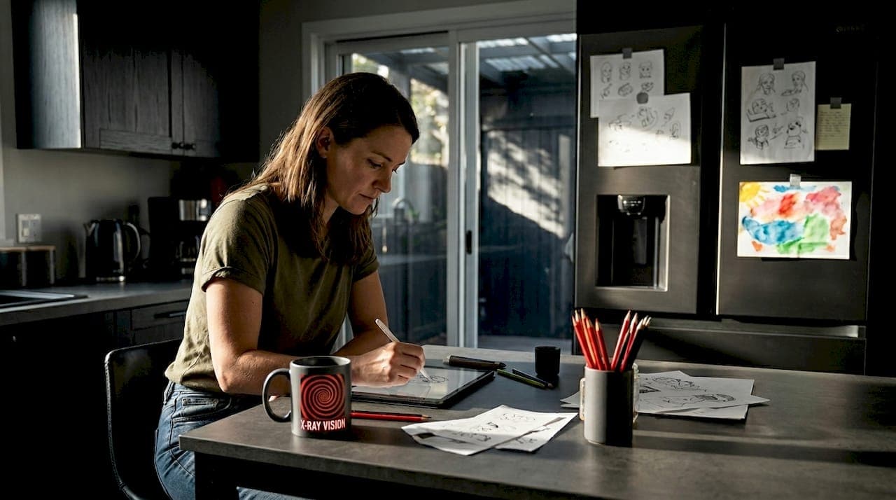
Gathering tools and inspiration: What you need before you begin
Now that you know what makes a cover effective, you'll need to gather the right tools and creative inspiration before starting the design process.
Before you open a design program or pick up a pencil, preparation matters. Rushing into design without the right tools or reference material leads to frustration and weak results. Here's what you need.
Design tools by skill level:
| Skill level | Recommended tool | Cost | Best for |
|---|---|---|---|
| Beginner | Canva | Free or low cost | Drag-and-drop layouts |
| Intermediate | Adobe Express | Free tier available | More control over fonts and color |
| Artistic | Procreate (iPad) | One-time purchase | Hand-drawn illustration style |
| Professional | Adobe Illustrator | Subscription | Scalable vector artwork |
| Traditional | Pencil, ink, scanner | Very low cost | Hand-drawn, then digitized |
Each of these tools has a real learning curve, but Canva stands out for parents and educators who aren't designers. Its templates are a starting point, not a finish line. Use them to understand layout, then customize aggressively.
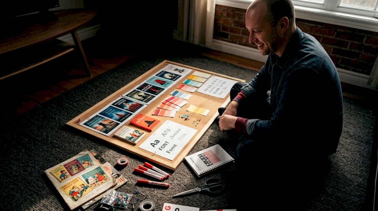
Examining well-known illustrated books inspires creativity and informs design choices. Before you design anything, spend time studying covers that already work. Visit your local library and pull twenty children's books off the shelf. Notice what they have in common.
Here's a quick checklist of inspiration sources to gather before you start:
- Browse classic illustrated children's books for examples of timeless cover design
- Screenshot appealing covers from Amazon or Goodreads in your target age group
- Look at award-winning picture books, Caldecott Medal winners in particular
- Save examples of fonts, color palettes, and character poses that feel exciting
- Check the illustration guide for practical tips on visual storytelling
Pro Tip: Create a physical or digital mood board before you design. Pin colors, fonts, characters, and cover layouts that excite you. This keeps your creative direction consistent and gives you something concrete to refer back to when you feel lost mid-project.
Preparation isn't the boring part. It's actually where most great covers are born.
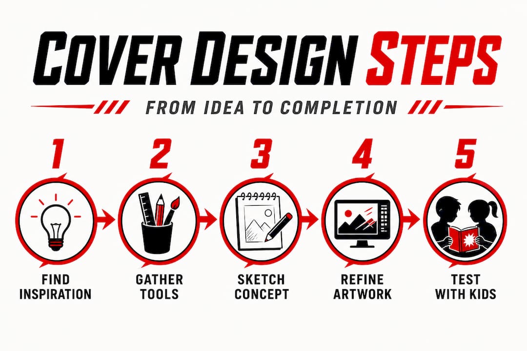
Step-by-step process: Designing a compelling kids' book cover
With your materials ready and inspiration in hand, it's time to move methodically through the hands-on design steps.
Great covers don't appear from nowhere. They are built through a sequence of deliberate decisions. Follow these steps and you'll have a strong draft faster than you expect.
- Sketch your ideas first. Don't open the computer yet. Grab paper and draw six rough thumbnail sketches of possible cover layouts. They don't need to be beautiful. They need to exist so you can compare them.
- Choose your focal image. Decide whether your cover will center on a character, a dramatic moment, or a symbolic object. Certain design components are particularly effective for engaging children's entertainment audiences, and a single strong focal point is at the top of that list.
- Select your color palette. Choose three to five colors maximum. Use a bright, dominant color for the background or main character, a contrasting accent color for the title, and a neutral to separate them.
- Pick your fonts. Use no more than two font families. One for the title, one for the author name. The title font should be bold, rounded, and easy to read. The author name font can be simpler. Test both at large and small sizes.
- Arrange your elements. Place the title at the top or bottom of the cover, never buried in the middle of the artwork. The main image takes center stage. The author name sits quietly below. Leave breathing room, or "white space," around every element.
- Create two to three variants. Change the color palette, swap the font, or flip the character position. Put them side by side. Which one makes you feel something immediately?
- Test at thumbnail size. Resize your cover to 100 by 150 pixels and look at it. Most children discover books through digital thumbnails first. If the image is unreadable, it needs simplifying. Step-by-step practical illustrations help capture and hold children's attention, and the same principle applies to cover compositions.
Comparing cover approaches:
| Approach | Strength | Weakness |
|---|---|---|
| Character-centered cover | Immediate emotional connection | Requires strong character design |
| Scene-based cover | Conveys setting and mood | Can feel busy without strong focal point |
| Object or symbol-centered | Works for mystery or adventure | Less emotional, needs great typography |
| Text-dominant cover | Strong for older readers | Rarely works for picture books or early readers |
Exploring children's book genres before designing can also clarify which approach fits best. A cozy bedtime story and a jungle adventure need very different visual energy.
Pro Tip: Print your cover draft at actual book size and hold it at arm's length. Seeing it physically rather than on a screen reveals problems you would never notice digitally, like a title that's harder to read than you thought or a background color that looks washed out when printed.
Troubleshooting and perfecting your cover
After creating your first draft, it's easy to overlook small enhancements or common mistakes. Here's how to review and strengthen your design.
You've got a draft. Exciting! Now comes the honest part: finding what isn't working yet.
Common problems and how to fix them:
- The cover looks cluttered. Remove one element. Then remove another. Covers almost never fail because they have too little on them. They fail because they have too much.
- The title is hard to read. Increase the font size. Add a subtle drop shadow or outline to separate the text from the background art. High contrast between text and background is non-negotiable.
- The character doesn't feel alive. Check the expression. A flat, neutral face doesn't invite kids in. Exaggerate the emotion. Joy should look like pure joy. Surprise should look unbelievably surprised.
- The colors feel muddy or dull. Increase the saturation of your main colors. Use a free tool like Adobe Color to find complementary color pairings that pop.
- It looks like an adult book. This is more common than you'd think. Scale up the character, scale up the font, boost the color intensity. Adult books whisper. Kids' books should shout.
"Small changes, like adjusting contrast or font size, can significantly improve the impact of a cover design for children."
Testing with real kids is the step most designers skip, and it's the most valuable one. Show three cover variants to children in your target age group. Don't explain anything. Just ask: "Which one would you pick up first?" Their answer will be instant and honest. Kids have no patience for politeness when it comes to books they find boring.
Ask a few follow-up questions too. "What do you think this book is about?" If their guess is wildly off from your actual story, the cover is sending the wrong message. The goal is to attract the right young reader, not just any young reader.
Also check how the cover works at multiple sizes: a thumbnail on a website, a medium-sized listing image, and full print size. A cover that only works at one size isn't finished yet.
Our perspective: Why simple, story-driven covers win over young readers
Here's something that might feel counterintuitive: the most elaborately detailed children's book covers often perform worse than simple ones.
It seems backward. More art, more effort, more impressive results, right? Not with kids. Young readers don't have the visual patience to decode a busy cover. When too many characters, too many objects, and too much texture compete for attention at once, the child's brain doesn't get excited. It gets tired. And a tired brain picks a different book.
The covers that genuinely electrify children tend to feature one character, one clear moment, and one unmistakable emotional signal. Think of a small figure standing at the edge of a huge forest. Or a wide-eyed cat holding a glowing lantern. Simple. Clear. Loaded with possibility. That story-driven illustration approach gives children something specific to latch onto and something unknown to wonder about.
That tension between what is shown and what is left to imagination is where a child's curiosity ignites. The best covers don't show you everything. They show you just enough to make you desperate to open the book.
Experienced designers sometimes struggle with this because restraint feels like giving up. It isn't. It's a creative discipline. And for children's books in particular, it's the difference between a cover that sells and one that sits unseen on a shelf.
The strongest creative advice here is this: when you're not sure whether to add one more element to your cover design, don't. The story lives inside the book. The cover's only job is to make a child reach for it.
Discover more inspiring children's books and covers
Want to see these design principles brought to life? Mark Watson's collection of children's books offers vivid, story-driven covers that put every strategy in this guide into practice.

Browsing professionally designed books alongside your own work is one of the fastest ways to sharpen your design instincts. You can browse children's books to see how bold characters, bright palettes, and clear visual storytelling come together on real, published covers. Each title in the collection demonstrates what genuinely engages young readers. If you're hungry for even more inspiration across genres, you can also explore all books for a broader look at what compelling cover design looks like across multiple reading audiences. Let great examples guide your next creative decision.
Frequently asked questions
What are the most important elements for a children's book cover?
Bright colors, bold illustrations, simple fonts, and a clear theme are key elements, as publishers use specific visual elements to attract young readers. A single strong focal image and high contrast between the title and background round out an effective cover.
Which design tools are best for non-artists creating covers?
User-friendly tools like Canva and Procreate are great for non-artists designing children's book covers. Canva in particular requires no prior design experience and offers templates sized for book covers.
How can I test if my book cover appeals to children?
Show the draft cover to children in your target age group and ask which version they would pick up first, without any explanation. Their immediate, unfiltered reactions are your most reliable feedback.
Can I use photos or must I draw everything?
Both photos and drawings can be effective, but practical illustrations tend to capture and hold children's attention more powerfully in this genre. Illustrations allow for the exaggerated expressions and vibrant colors that kids respond to most.
What's a common mistake to avoid in kids' book cover design?
A cluttered cover or hard-to-read fonts can drive young readers away. Remember that adjusting contrast or font size can make a significant difference in how effectively your cover communicates to children.